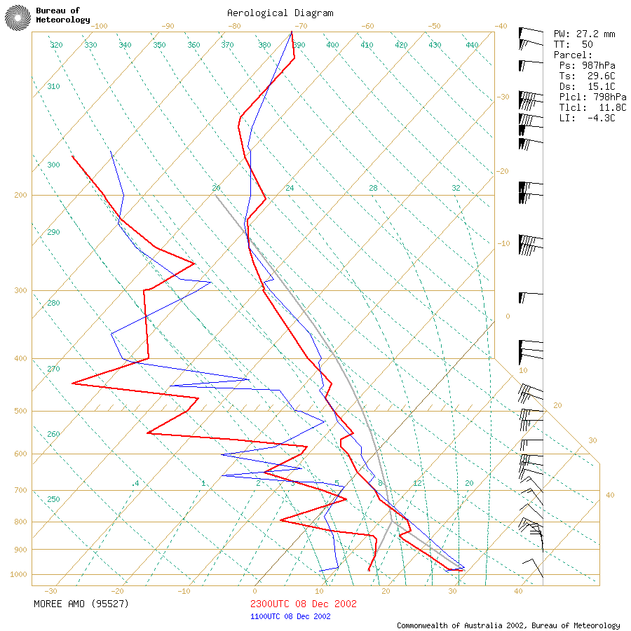
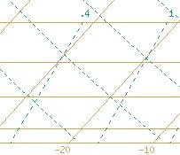
The pale yellow/brown
lines that originate from the bottom of the
Skew-T and travel diagonally upwards to the right are the temperature lines.
The scale is on the bottom of the Skew-T. This increases by 10C increments.
Upon learning this, we can now interpret part
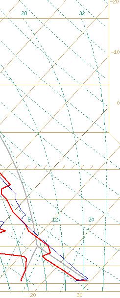
of the Skew-T. The large thick red line
on the right, is the temperature line.
The red line on the left,
is the dew point line. The temperature line is always to the right
of the dew point, although in very moist situations, they can be overlaid
over each other, indicating 100% humidity at a particular level(s).
The red lines correspond to the time in red on the bottom of the Skew-T.
The blue lines are the previous sounding (normally around 12 hours before),
and corresponds to the time in blue at the bottom of the Skew-T.
There is one other line, the grey line, which is the theoretical air parcel
line, it is probably the most important line in the Skew-T, however its
behaviour and interpretation is somewhat more complex and less straight-forward,
we will deal with this a little later on.
The horizontal
dark yellow lines are the height and pressure
lines. These are fair uniform, however if you look closely, they
dip in slightly towards the left of the graph. This is where the
colder temperatures are, and denote how cold air causes the air to be more
dense, hence heights are lower. This is the same as geopotential
height, where colder air above, has a smaller geopotential height as
cold air is denser then warm air, and therefore causes a lowering in height
with pressure. Unfortunately, the BoM soundings don't display the
height, but if you look at University
of Wyoming soundings then you will see the height (in metres) at which
these levels occur in the atmosphere. Remember that these heights
are not constant, and only apply to the particular atmosphere the sounding
was taken in! Its also important to note that pressure decreases
with height. So that 700mb is actually higher than say 800mb.
The reason for this is because air becomes compressed at the surface with
the weight of all the air above it. So the pressure at the surface
is greater then a few kilometres up in the atmosphere.
Ok, in knowing that we're ready to interpret
part of our Skew-T. Lets read some temperatures off it and get an
idea on what it's trying to tell us! Lets look for the 800mb temperature,
see where the red line crosses the 800mb line? The temperature at
800mb there is around 14C, simply follow the diagonal lines down to read
the temperature off. What about dewpoint? We use the same method!
Here we can tell that the dewpoint is around -5C at 500mb. The surface
dewpoint is around 15 degrees (bottom part), note that the surface is not
1000mb here because Moree is actually around 200m above sea level, so the
surface pressure here is actually closer to around 980mb. Remember
this, it will come in handy for later! One of the advantages the
BoM Skew-Ts do give us though is the previous sounding before hand, here
we can see that the surface DP has increased from around 7.5C to 15C in
the last 12 hours! Scroll back up and have a look at the temperatures
too - what can we tell about the atmosphere? Lets compare...
|
Level
|
Current Temperature
|
Previous Temperature
|
Temperature Difference
|
|
700mb
|
6C
|
6C
|
0C
|
|
600mb
|
-4.5C
|
-2C
|
-2.5C
|
|
500mb
|
-12C
|
-12C
|
0C
|
|
400mb
|
-23C
|
-21C
|
-2C
|
|
300mb
|
-39C
|
-38C
|
-1C
|
When you get used to looking at Skew-Ts, you
won't have to do this - you'll see it straight away (perhaps you already
can), that the overall trend in the upper atmosphere is a cooling one.
And from what we learnt in the previous section, upper atmospheric cooling
will enhance instability!
Ok, so we can read temperatures and dewpoints
off the Skew-T, what else? How about those dashed
green lines that rise diagonally to the right,
but not quite parallel to the temperature lines? They are the
saturated mixing ratio lines. This is expressed in terms of grams
of water vapor, per saturated kg of air, or g/kg. The importance
of these will be highlighted later.
Still with me? Ok, this is going to get
wordy now...but it's important to understand these concepts...
The dashed green
lines that originate from the bottom, and
rise
diagonally to the left, represents the Dry
Adiabatic Lapse Rate abbreviated DALR. That is, the path that a
parcel of unsaturated air will rise in the atmosphere. Unsaturated
is air of which the humidity is less then 100%. As air rises, the
pressure is less, and thus air being a gas obeys the gas law and expands
under lower pressure. This expansion causes the air to cool the
air does not cool due to temperature exchange with its surroundings, in
fact very little of this occurs as air is a poor conductor of heat.
Hence, we arrive at the term adiabatic, which essentially means without
any exchange of heat. The reason why the air cools as it expands
is because there is no heat added into it, yet the overall size of the
parcel is increased. So the heat that was spread in the small parcel
near the surface, now has to be distributed into a much larger parcel higher
in the atmosphere. Thus, the heat is less concentrated, and causes
the air to become cooler. An analogy that could be used, would be
the difference between a 1000W heater in a small bedroom, compared to a
1000W heater in an open lounge room. The same amount of heat is present,
but the lounge room will be cooler (assuming the air mixes well), as theres
more space to heat than in the bedroom.
Unsaturated air cools rather quickly, 9.8C/km
and frequently will become colder then its surroundings if it rises at
this rate for a long period of time. And, as soon as it becomes colder
then the surrounding air, it begins to descend as cold air is denser than
warm air, it sinks. Given this, we could already begin to make the
assumption that dry air (unsaturated air), will cool very quickly, and
descend back to the ground without traveling very far into the atmosphere.
This indicates that dry air is not conductive of convective environments,
although there are always exceptions and these will be discussed later.
The lines that represent the DALR are in 10C increments and start at the
same point the temperature lines do.
The dashed green
lines that originate at the bottom of the
Skew-T, but appear to go almost straight up first before veering towards
the left is the Saturated Adiabatic Lapse Rate abbreviated SALR.
That is, the path that a parcel of saturated air will rise in the atmosphere.
Saturated air is air that has 100% humidity. It also cools as it
rises in the atmosphere, it loses heat just as quickly as an unsaturated
parcel, however it also has heat added into it by the process of water
vapour condensing into droplets. The reason for this is because in
order to create water into water vapor or steam, we need to add heat to
it (imagine boiling water on a stove). The water vapour in the air,
exists because heat was added to cause it to vaporise. Now, heat
is simply a form of energy, and energy must always be conserved i.e.,
it cannot be destroyed. Condensing is the opposite of vaporising, and thus
as it condenses, it releases heat. This is called latent heat
essentially meaning hidden heat. As soon as a parcel of air hits 100%
saturation, if it cools any further, itll begin to condense moisture.
So as it expands, it cools, but theres also heat added into the parcel
as it condenses, but the rate of expansion cooling is still greater then
the latent heat added to it, this is why it stills cools, however not quite
as fast. The warmer the condensed parcel of air is, then the more
heat that is released by this process occurs. This is a an important
note, as it explains why in very moist surface situations, just a small
fluctuation in moisture can have significant impacts on CAPE, LI and instability.
Notice on the Skew-T, how the SALR lines tend
to bulge out, at first glance it looks like the air is actually getting
warmer as the air rises! However, remember that the temperature lines
are diagonal, so the SALR lines are skewed somewhat. If you look
at it closely, you can see that they are still cooling, just much slower.
Also, notice how the SALR lines begin to follow the shape of the DALR lines
as height increases? This is because as water gets condensed out,
the parcel of air begins to lose its moisture, eventually the small amount
of water that is condensing is so insignificant, that the air parcel begins
to cool at the DALR.
On the right hand side of the Skew-T, youll
see flags along the side at different levels. This tells you the
wind direction and strength at that level (just follow the pressure line
and read the level that wind is on). When looking at the wind flags,
the direction is quite easy to read, but might be a little difficult to
comprehend for the first time. The part of the flag with the barbs
points to the direction the wind is coming from. The end point (pointy
section) points to the direction the wind is travelling to. On a
skew-t, if the barb section points towards the top of the page, then the
wind is coming from the direction of 0 degrees. If it points towards
the right of the page, the wind is coming from 90 degrees. And so
forth. Effectively, imagine you have a 360 degree compass on the
page, with the top of the page being north/0 degrees. The direction
can be a combination, so can point in any one of the 360 divisions.
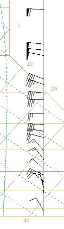
The barbs tell you how fast the wind is travelling.
Half a barb stands for 5kn, a full barb stands for 10kn, and a bold barb
stands for 50kn. Simply add all the barbs up together to get the
wind speed. The direction from the bottom wind barb in the above
example is NW at a speed of 10 knots.

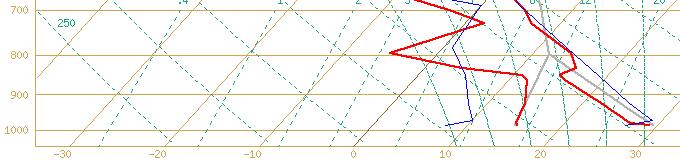
Here's an example. The top wind flag has
a wind speed of 65 knots (one bold barb, one full barb and one half barb),
and then the bottom has a wind speed of 75 knots (one bold barb, two full
barbs and one half barb). Both of the winds here are from the WNW
(almost W).
Still not sure? Here's another example:
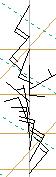
Winds at the bottom are from the NE at 15 knots
here, and towards the top they're from the SW at 20 knots. It's easy
once you get the hang of it!
That's the basics of Skew-Ts - once you get
the hang of it you'll be able to read them in seconds! Ok, but how
do we tell whether the atmosphere is stable or unstable? I think
that needs a new section... |